GINCO PROPERTIES | LOGO DESIGN
A MODERN IDENTITY FOR A VISIONARY PROPERTY DEVELOPER
EXPERTISE
Brand Identity Design
Real Estate Branding
Visual Strategy
SERVICES OFFERED
Logo Concept Development
Typography & Colour System
Brand Mark Rationalization
Usage Guidelines & Applications
Social Media
Website Design & Development
Print Production
The Challenge
The Approach
Kmistree began with a positioning workshop a structured two-hour session with the Ginco leadership team to map out the brand’s values, competitive context, and aspirational positioning. Three directional territories emerged from this session:
Architectural precision – A mark inspired by clean geometry (circular), reflecting the precision of construction and the confidence of engineered structures.
Heritage and permanence – A mark rooted in classic typographic tradition, communicating longevity and trust to investors reflected with golden color tones.
The team presented three to the Ginco Properties directors in a structured review session, where each concept was shown in context on a hoarding, on a business card, and in many digital formats.
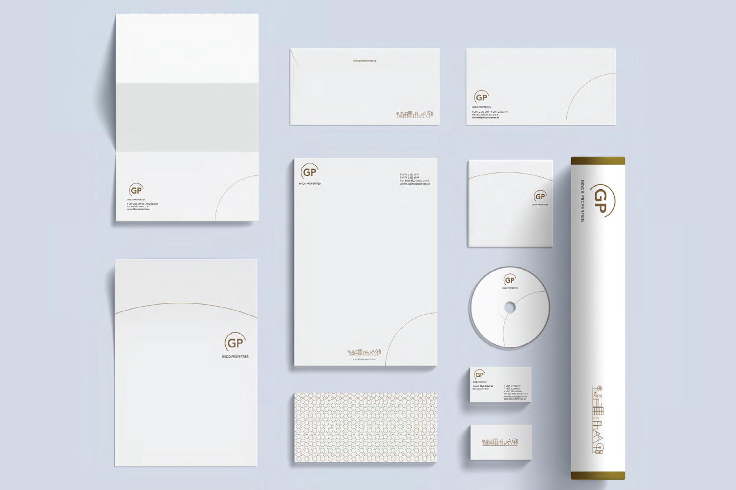
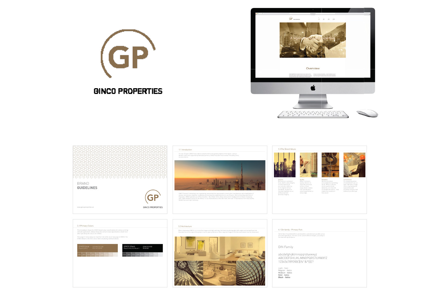
The selected direction fell within the architectural precision territory: a wordmark with a geometric symbol derived from the G and C initials, forming a structure that reads both as a monogram and as an abstracted building form. The colour palette was refined over two rounds: the final selection of warm gold, and white was chosen for its association with quality and its strong contrast performance across all substrates.
A full brand guidelines / standard document was developed alongside the mark, covering minimum size specifications, clear space rules, approved colour combinations, incorrect usage examples, typography system, and approved photography style. This ensured that every future touchpoint, whether produced by Kmistree or by a third-party supplier – would maintain visual consistency.
The Output
- Primary logo in four approved colour variants (full colour on white, full colour on navy, white reverse, single-colour monotone)
- Geometric brandmark / pattern (symbol only) for use at small sizes and as a standalone icon was created
- Full typography system: primary typeface (serif for headlines), secondary typeface (sans-serif for body), approved weights and sizes
- Colour palette with CMYK, RGB, HEX and Pantone references for both print and digital production
- Brand standards document (PDF, 24 pages)
- Master artwork files in AI, EPS, PDF, PNG and SVG formats
- Application mockups: Business card, letterhead, presentation cover, CD cover, social media profile, website, document folder, stamps etc.
The Outcome
The new Ginco Properties identity launched on schedule for the sales event. The reception from the client team was immediate: the sales director noted that the identity gave their printed materials ‘the credibility we knew the product deserved.’ The identity has since been applied across the full Ginco project portfolio — appearing on physical signage at active construction sites, on developer profiles submitted to Dubai Land Department, and across digital channels.
The brand has remained consistent across all applications for two years without requiring revision — a measure of the rigour of the initial standards document. Kmistree’s ongoing relationship with Ginco has extended to office branding and corporate gifting projects (documented in a separate case study), reflecting the confidence the client has placed in the creative process & commitment towards client.