CRAFTING SENSORY RICH PACKAGING FOR A HERITAGE INSPIRED FOOD BRAND
EXPERTISE
Packaging Design FMCG Branding Cultural Storytelling Social Media Marketing Online Advertising
SERVICES OFFERED
Logo Development Packaging Structure & Label Design Visual Language & Pattern Development Product Storytelling & Copywriting Photography & Animation Website Design & Development Print Production Social Media Management
The Challenge
Kaikuu Foods is a mid-premium Foodstuff brand created for the UAE & KSA market based in Dubai from India, with an initial portfolio of 24 SKUs spanning spices, botanical syrups, and condiments. The brand was built from the ground up: there was no existing identity, no packaging, and no precedent in the founder’s portfolio to reference. Everything had to be created simultaneously, brand name rationale, visual identity, packaging system, and bilingual (English and Arabic) copy. While ensuring the result was capable of standing on shelf next to both imported European premium brands and established regional competitors.
The packaging challenge was layered. Regulatory compliance in the UAE requires Arabic text on all consumer food and beverage packaging, with specific rules around ingredient declarations, nutritional information, and country of origin. The design had to accommodate these mandatory elements without compromising the premium aesthetic. Shelf performance in a GCC retail context, bright lighting, close product proximity, a highly diverse consumer base — demanded a design that communicated quality briefly while distinguishing between multiple SKUs in a coherent system.
The founder’s ambition was explicit: Kaikuu should feel like it belongs to a mid-market FMCG B2B brand targeting GCC nationals, not in a mass-market supermarket aisle.
The Approach
The Kmistree team began with a category audit — reviewing packaging across premium botanical beverage brands globally, with a focus on the visual codes that signal ‘mid-premium’ in the GCC market specifically. The audit identified a design gap: most regional competitors defaulted to either heavily illustrated traditional Arabic patterns or clean-but-generic Scandinavian minimalism. Neither captured the opportunity to merge rich Islamic patterns with contemporary Middle Eastern architecture sensibility.
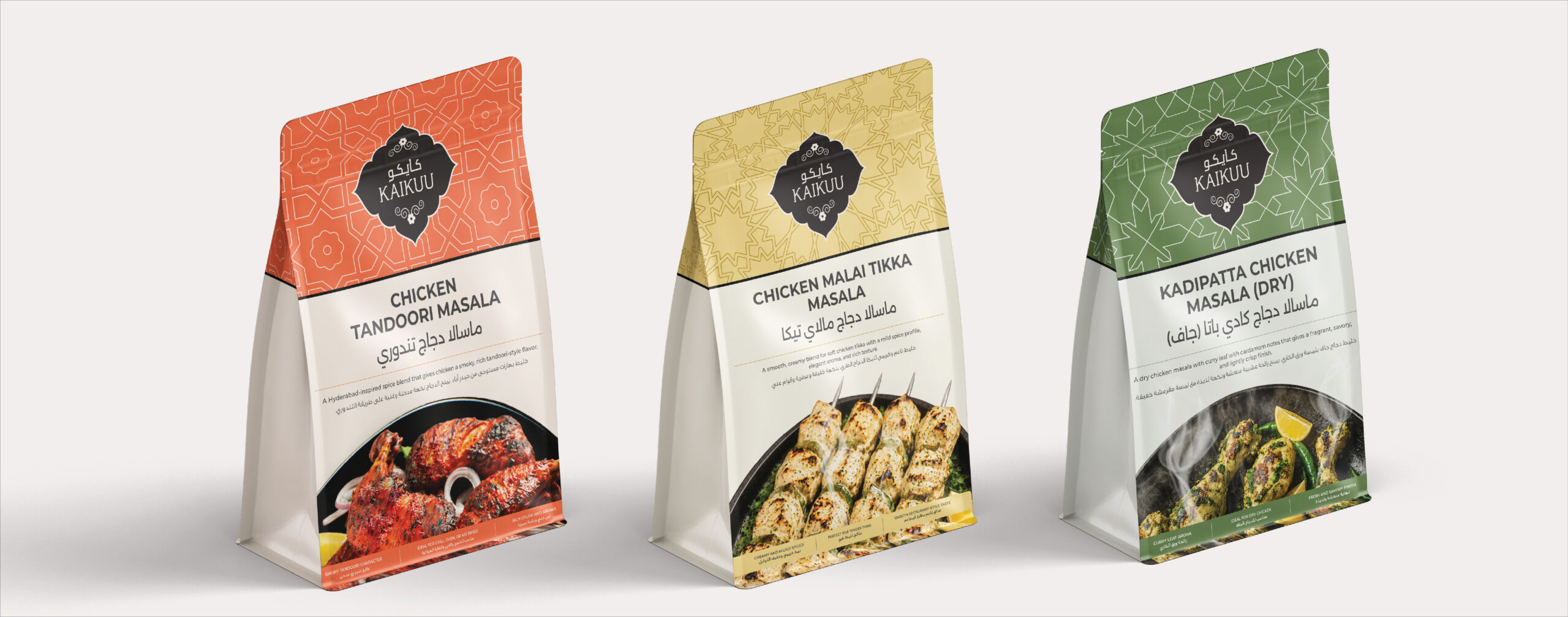
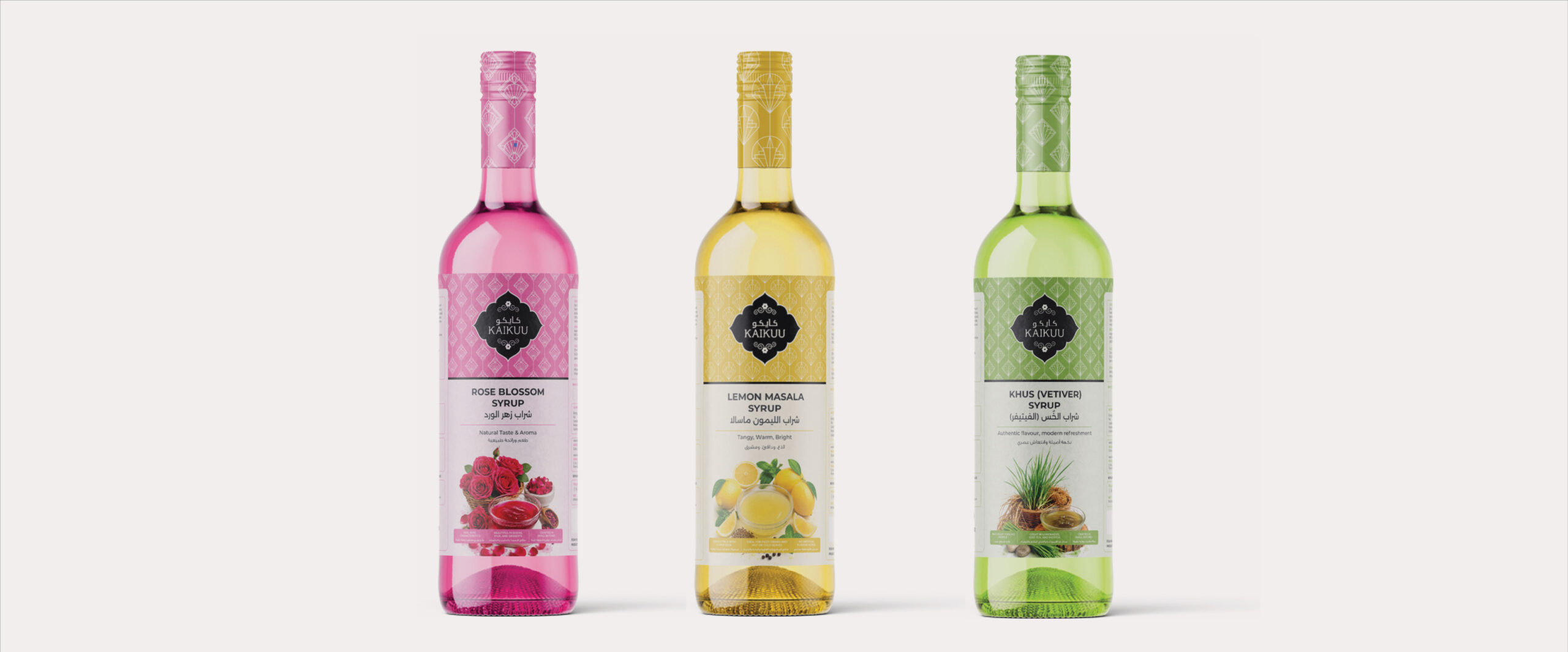
The chosen design direction — developed after three rounds of concept work — was built on a Islamic pattern / illustration system. Each SKU received a unique illustration art-deco specifically for the brand. These illustrations were rendered in a fine-line style that communicated craft and precision, then applied to a label structure that used a dark, richly textured background to differentiate Kaikuu from the typically white or clear-label competition.
The bilingual copy system required particular care. Arabic text was not simply translated from English — it was written to be culturally resonant by a Arabic copy-writer, using language that would appeal to both Arabic-speaking nationals and the large English-speaking expatriate and tourist audience. Product names, product descriptions, and the brand tagline were developed in both languages simultaneously, with native Arabic copywriting review as part of the process.
Structural packaging decisions — bottle shape, closure type, label dimensions — were made in collaboration with the client’s manufacturing contacts, ensuring that the final design was producible within the specified cost range and compatible with the client’s selected bottling partners.
The Output
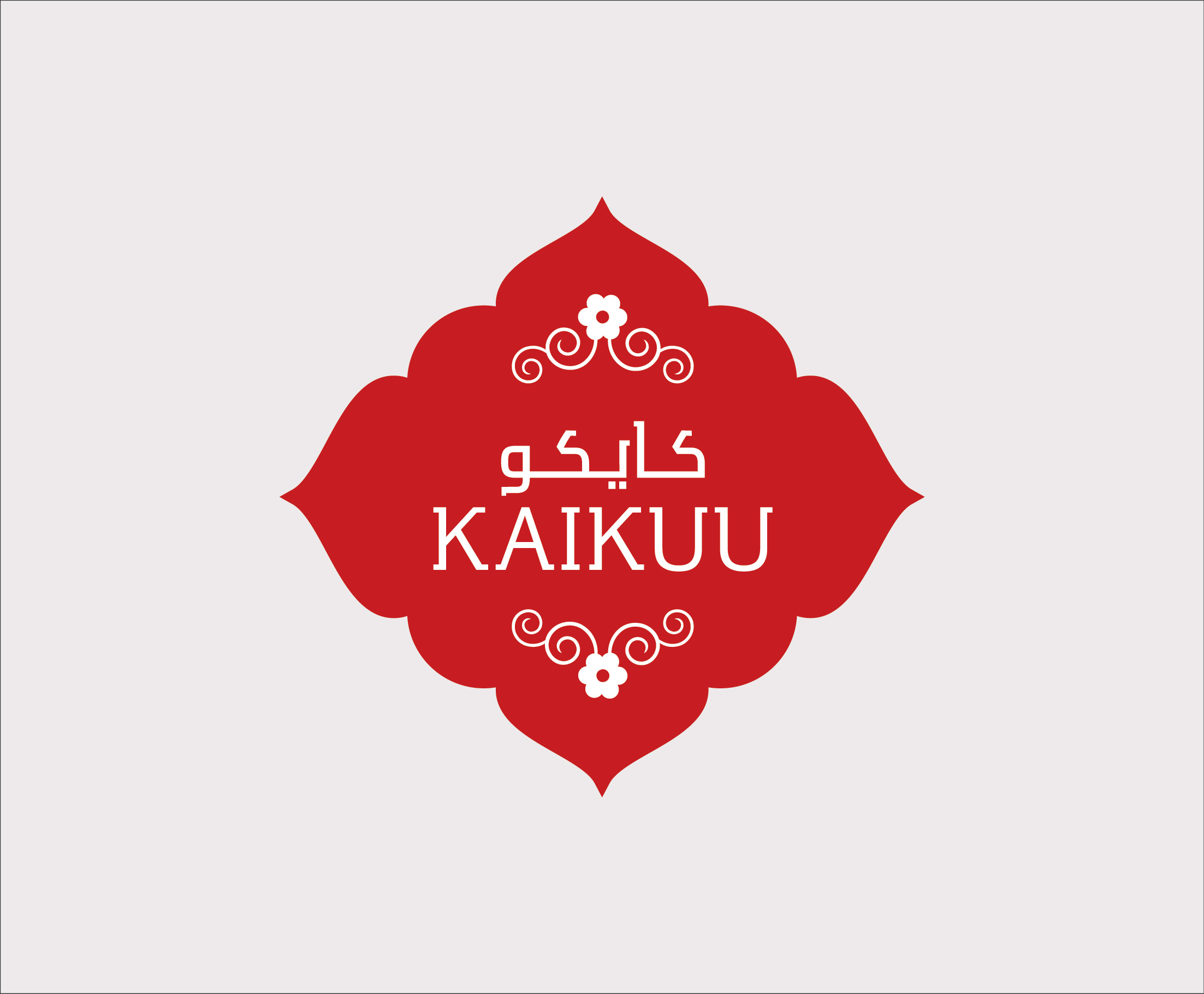
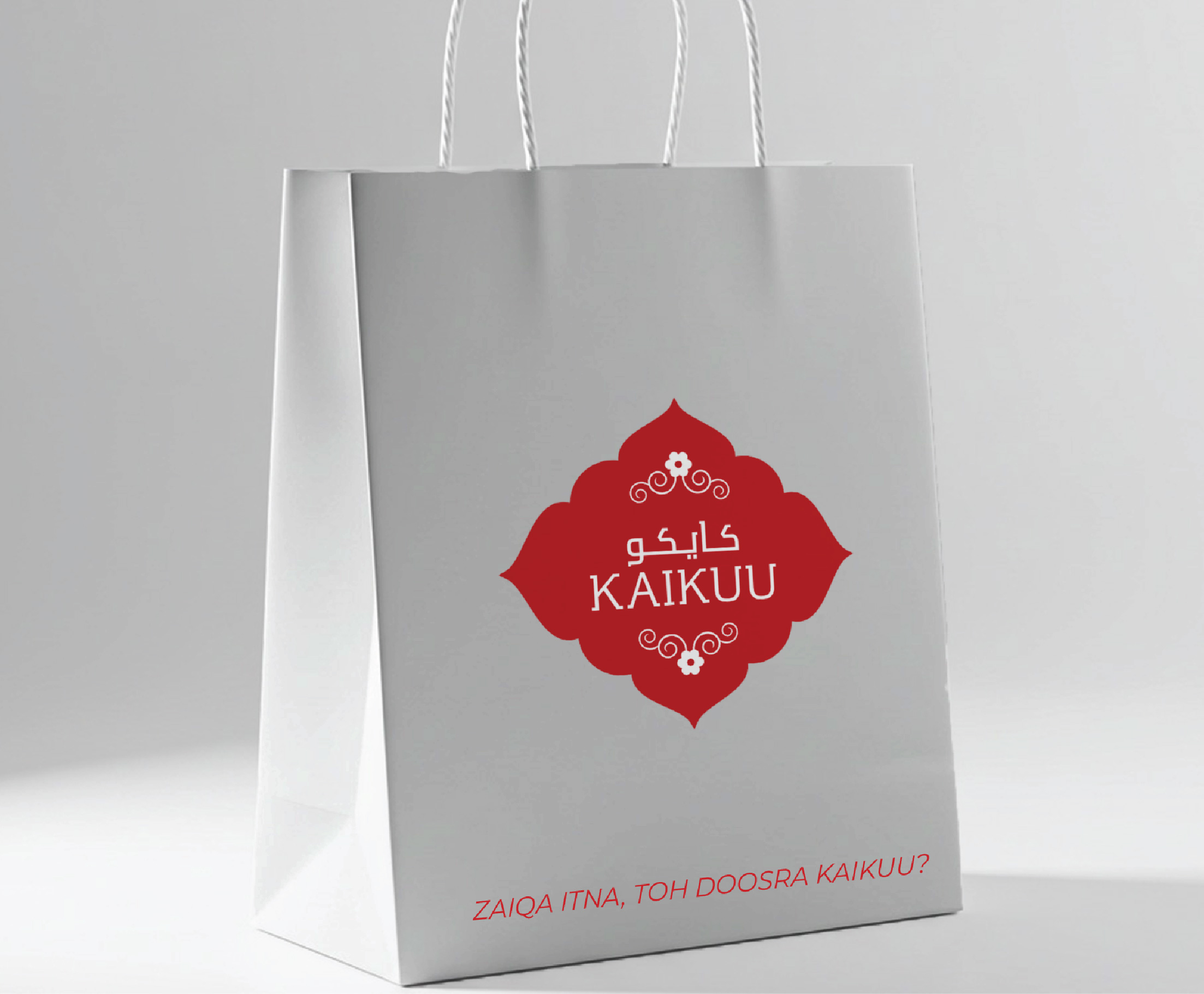
Brand identity system: Kaikuu wordmark, brandmark, colour palette, typography, tone of voice guidelines
Multiple Islamic illustrations for each product
Complete packaging design — front label, back label, neck label
Bilingual (English and Arabic) copy for all label elements: product name, description, ingredients, nutritional information, usage suggestions, brand story
Print-ready artwork files with full technical specifications
The Kaikuu Foods packaging system was delivered within the project timeline (4-3 weeks) and has since entered the client’s production planning phase. Wholesalers / retailer meetings with UAE specialty food distributors and hotel procurement teams have been conducted using the print-ready packaging artwork and brand presentation materials developed by Kmistree — and have generated strong early commercial interest & purchase.
The design has been shared in Kaikuu’ s investor presentation deck, where the packaging quality has been cited as a key factor in building confidence in the brand’s positioning and retail viability. The bilingual system has enabled the brand to approach both English-speaking and Arabic-speaking buyers without requiring any adaptation of the packaging itself.
Client Voice
“Kmistree created something we couldn’t have imagined ourselves. The illustrations, the vibrant color background, the
logo, the Arabic copy — it all came together as a brand that looks like it’s been on shelf for years. Every buyer we’ve
shown it to has said the same thing: it looks authentic, premium, and it looks like it belongs here.”